


Xushi Ko
Branding, Menu Design, UX Design
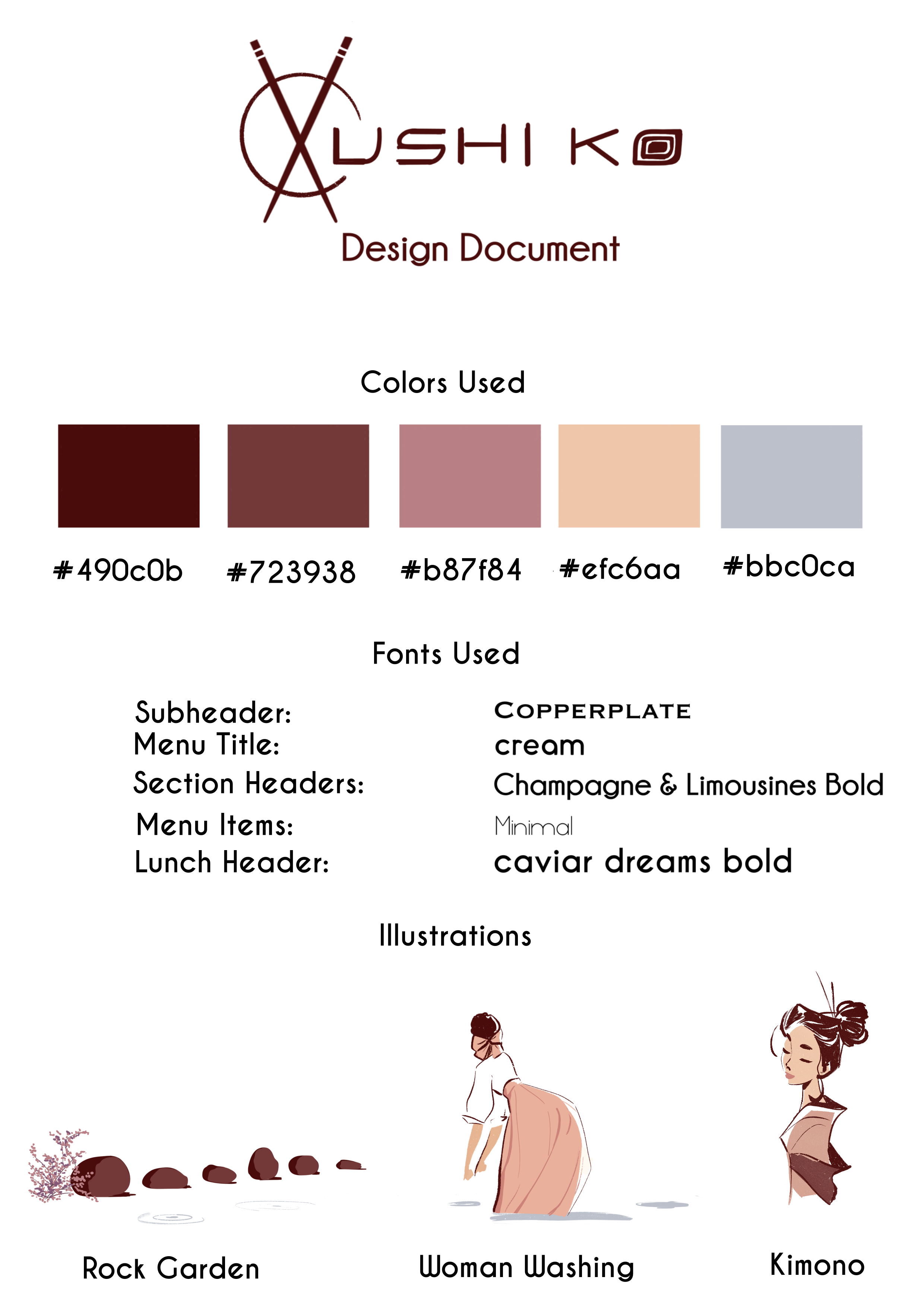
My Role: Art Director, Designer
Company: Ivan Delacruz Illustration
The Brief: I was asked to create several illustrated backgrounds for their existing digital menu. Their menu was extensive, often containing 10-20 items on a single page - too much to allow any illustrations to be included without creating clutter.
The Process: I proposed a different approach: let’s focus on the beauty of less.
The Outcome: A complete rebrand of the menu presented efficiently and elegantly while housing the same number of items.
imagine a rock garden…
…peaceful, elegant, and intentional. We focused first on the core question: what is the intention of the menu? To present the items to the consumer in a pleasing way.
The project became a rebranding initiative. We began a process of cutting, consolidating each page to convey the spirit of a carefully curated garden.


less is more
We created new pages each with a single focused theme. The visual design further emphasized minimalism through the use of white space, a minimal color palette, and simple typography.


art with intention
The illustrations were used strategically to help guide the consumer’s eye down the page. Instead of sitting behind the menu items, I placed them within the white space to compliment design and bring about a feeling of tranquility.


results
Xushi Ko’s rebranded menu launched in the Spring of 2020, receiving an overwhelmingly positive response from both the management, staff, and consumers. Consumer images of the new menu circulated social media for several months afterward. The client has hailed the new menu as a driving force in bringing in new customers during the Q2 of 2020.
